When Colors Rule on the Street!
Some photographers decide to shoot all in black & white or all in color. Although I do prefer B&W for the most part, I also know how to recognize a subject that would lose all interest in monochrome. Sometimes the color is such a big part of the story that removing it would almost be a crime.
I used to shoot RAW and made the final decision in post processing, but this year I’ve only shot JPEGs and embraced the limitations. After all, it wasn’t that long ago that I was making the decision to put a roll of color or monochrome in my camera and lived with that decision.
I do believe that shooting color is often more challenging, you have to be more aware of the many distracting elements that can overpower your subject. Making quick compositional decisions to tell your story while eliminating distractions from the frame before you press the shutter is a balancing act.
I made a selection of recent pics to illustrate that colors often rule on the streets!

Minneapolis

New York

Paris

Bayeux
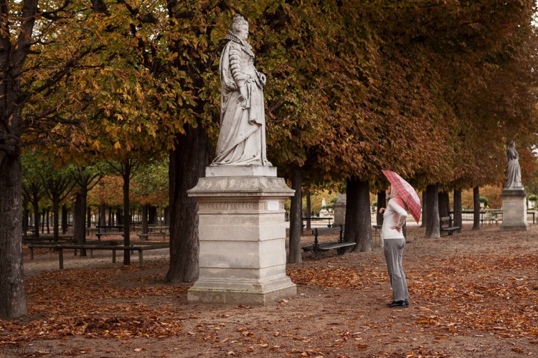
Paris

New York

Los Angeles
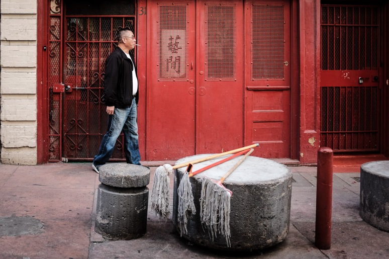
San Francisco

Mont Saint Michel
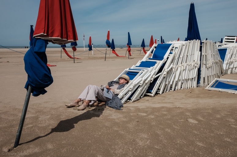
Deauville
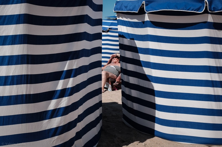
Cabourg

Melbourne

New York

Minneapolis

Minneapolis

Paris
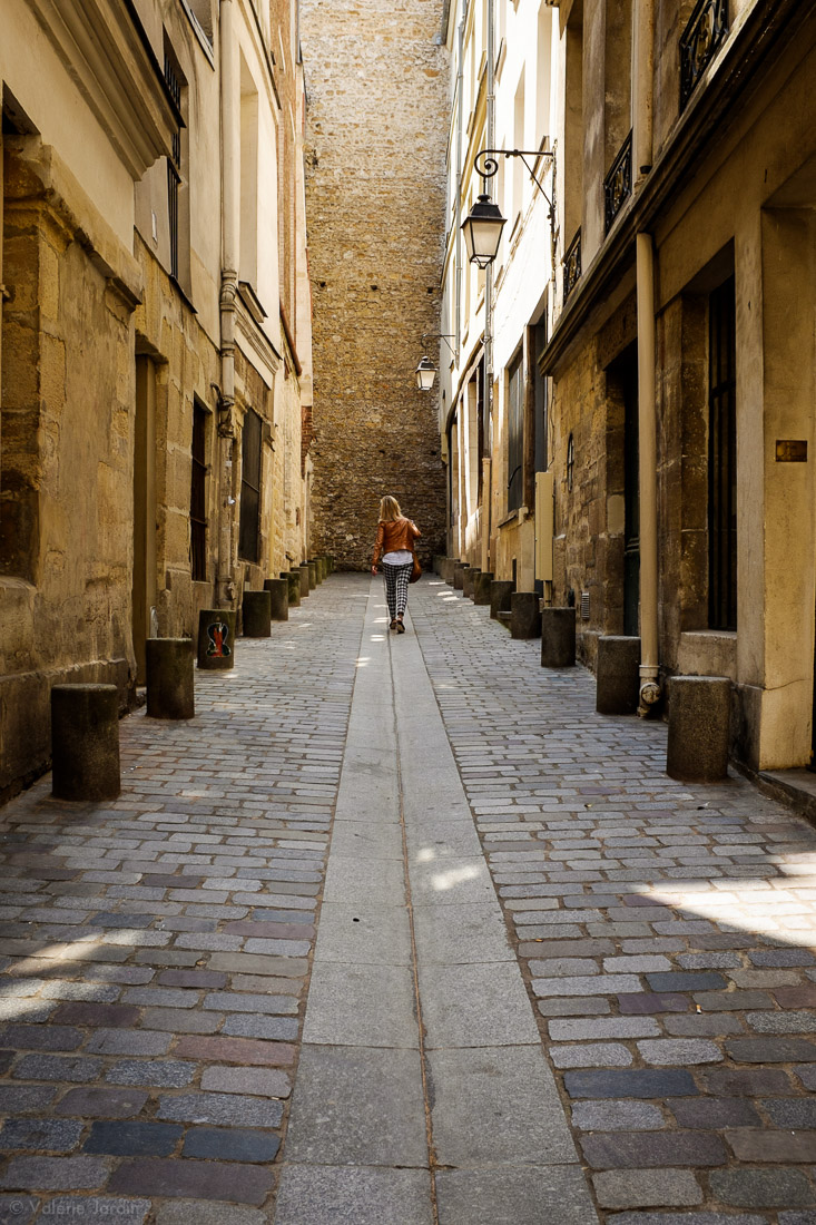
Paris

Rome

New York
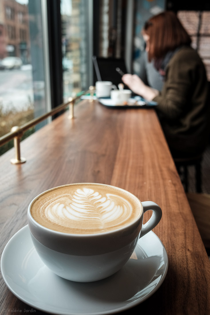
Minneapolis

Rome

Rome
Thank you for visiting, please leave a comment below!



beautiful pictures!
LikeLike
I’m amazed by your sense of composition and color – keep it coming, I need to learn !
LikeLike
I usually use JPEG simply because my camera is old and RAW quickly fills up the card. Also, I don’t know enough to really make good use of the post-processing programs. So I consentrate, as you say, on getting it right the first time! I love these photos, and as I study your color shots, I’m beginning to see that you don’t necessarily do contrasting colors, but often do things like a brown coat in front of a yellow wall and a bright red coat next to brick. You have made me begin to watch for these things on the street. Not sure I have your patience yet!
BTW, I just discovered that Google has been shooting many of the blogs I follow into the spam folder and have spent the last two weeks pulling them out and catching up, so I’m still looking at things posted weeks ago. What on earth are they thinking?
LikeLike
I love your black and white shots and I love your color shots. It’s interesting to see photos and subjects from so many different cities around the world. You certainly manage to capture great moments!
LikeLike
These are great and a good reminder to us all. I’m not saying that its the same, but photographing with jpegs instead of raw is at least one step closer to the film experience. I usually set my x100s to bracketed simulation modes (provia, velvia, monochrome+R) to cover both those colour and b&w situations you come across on the street. Mind you, I do find that the Fujifilm jpegs are quite forgiving to the sliders in lightroom – I don’t remember having that much leeway with my old canon jpegs.
One thing I do wish is that the x100s firmware would be upgraded so that we could have Classic Chrome and the Acros film simulations – I shouldn’t have to buy a new camera just for that. Any chance you could use your influence Valerie? 😉
LikeLiked by 1 person
Haha, thanks Antonio! Sorry, I have no influence at Fujifilm 😉
LikeLike
I love them!!! 😀
LikeLiked by 1 person
Thanks Julex!
LikeLike
Superbes photos — vraiment magnifiques !! I usually prefer BW for street photography too (perhaps because it imparts a certain timelessness?). But you’ve proven that color has its place too! I absolutely love this set, Valérie.
On a related note: Is there any chance you’re planning on doing one more photo talk at the Minneapolis Photo Center before your exhibit closes? I was heartbroken to discover I just missed you two weeks in a row. Gah!! If you’re planning any more talks please let me know; I would love to hear the stories behind some of your images.
LikeLiked by 1 person
Merci! Sorry, no more gallery talks for this show but please join the Exhibit Closing Reception on Aug. 26th from 6:30-9:00 pm. See you there!
LikeLiked by 1 person
I will do my best to make it. Thank you, Valérie!
LikeLike
Outstanding photographs. A great inspiration.
LikeLiked by 1 person
Thank you for your kind words and for visiting my blog!
LikeLiked by 1 person
Enjoyed seeing how you use color in your photos. Thanks.
LikeLiked by 1 person
Merci Donnette!
LikeLike
Nice!
LikeLiked by 1 person
Thanks for visiting my blog!
LikeLike
Great set of photos. I can see Classic Chrome in most of those images but in a few the colours seem too vibrant for that film simulation (although work very well). I’m curious if they are a different film sim or if you’ve done some tweaking afterwards?
Keep up the inspiring work!
LikeLiked by 1 person
Thanks! Actually I started using Classic Chrome this year, last year I played with other film sim by Fujifilm. And sometimes, just like the yellow lines and red helmet which I shot yesterday in Minneapolis, Classic Chrome is just not vibrant enough for the subject at hand and I make the change in camera before I press the shutter to get it just the way I envision it.
LikeLike
Great set of photographs, One of the best yet.
LikeLiked by 1 person
Thank you dear Sheila!
LikeLike
Awesome how the colour pops out with your final edits! Amazing collection!
LikeLiked by 2 people
Thanks!
LikeLiked by 1 person